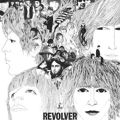
For our album art lesson, everyone had to bring in a minimum of one album to talk about, but most brought at least 3. Initially, we displayed all of them on the table, which allowed us to see the similarities and differences between them. This helped us to discover some album art conventions.
Some conventions:
 - album name and artist name
- beauty shot of artist
- track-list
- logo/type face
- record label
- key iconography/visual motif
- copyright
- bar-code
- parental advisory
 This, in turn, allowed us to figure out how we could categorise these albums, for example, by...
- genre
- format
- monochrome vs. colour
- solo vs. band
- gender
- concept vs realism
- decade
- audience
- compilation vs. one artist
After having this discussion, we each talked a little about the album we brought in. I brought in Eliza Doolittle's debut album, for example, and talked about how the London icongraphy, as well as the random, fun images, establishes her quirky identity and fun, not-serious ideology and music style. Overall, this exercise enabled us to establish the purpose of album and album art, some of the main reasons being to...
- connote artist identity
 - establish genre/ the flavour of the album (acts as a visual representation of the music)
- attract new and old audiences/established fans (increasing fan base)
- make money (providing another platform to sell the brand)
- inform the audience (artist/album name, tracklist, record label, etc)
- stand out and attract attention
Finally, we discussed the role of the different sleeves of the digipack;
- Front sleeve = attracts
- Back sleeve = informs
- Middle panel = immerses the audience further
No comments:
Post a Comment